Перевод статьи «CSS Underline: 20+ Examples».
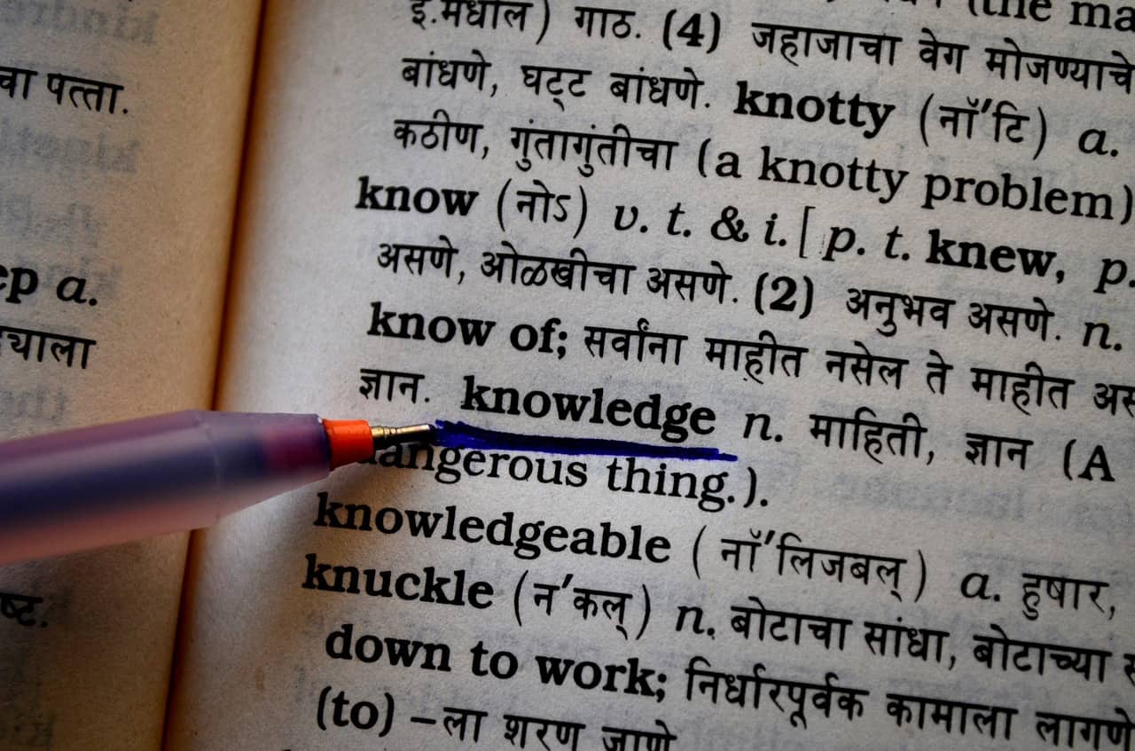
При создании ссылок или анимаций для кнопок меню у вас может возникнуть необходимость использовать подчеркивание. Из этой статьи вы узнаете о нескольких способах создать эффект подчеркивания с использованием CSS-свойств text-decoration, border-bottom, background-image, box-shadow, а также при помощи SVG.
CSS-свойство text-decoration
Свойство text-decoration — самый простой способ подчеркнуть текст. Но этому способу не хватает настраиваемости, и это проблема. Более продвинутые в этом смысле способы подчеркивания мы рассмотрим чуть дальше по тексту.
Давайте посмотрим, как при помощи text-decoration можно сделать простое подчеркивание.
Свойство text-decoration — это сокращенный вариант записи трех других свойств:
text-decoration-line(указывается обязательно): определяет, где должна проходить линия подчеркивания. Возможные значения — overline (над текстом), underline (под текстом), underline overline (и над текстом, и под ним), line-through (перечеркивание текста).text-decoration-style: определяет стиль линии. Возможные значения — solid (простая прямая линия), dotted (линия из точек), dashed (пунктирная линия), wavy (волнистая линия), double (двойная линия).text-decoration-color: определяет цвет линии. Указываться может по-разному, например, #ccc, blue, currentColor.
Вот несколько примеров:

Чтобы убрать подчеркивание, нужно просто указать text-decoration: none.
Если вы хотите добавить подчеркивание, которое будет появляться только при наведении курсора, используйте следующие CSS-правила:
a { text-decoration: none; }
a:hover { text-decoration: underline; }
Альтернативой свойству text-decoration может послужить свойство border-bottom. С его помощью вы также можете задать внутренний отступ (padding) и отодвинуть линию подчеркивания от текста. В следующем примере первая ссылка создана при помощи свойства text-decoration, а вторая — при помощи border-bottom:

a:nth-of-type(1) {
  color: #32557f;
  text-decoration: underline #32557f dashed;
}

a:nth-of-type(2) {
  color: #32557f;
  text-decoration: none;
  border-bottom: 2px dashed #32557f;
  padding-bottom: 3px;
}
А теперь давайте перейдем к более интересным способам подчеркнуть текст.
Градиентное подчеркивание
При помощи свойства background: linear-gradient и других свойств фона можно создать градиентное подчеркивание. Вот пример:

background: linear-gradient(to left, #f69ec4, #f9dd94 100%);
background-position: 0 100%;
background-size: 100% 2px;
background-repeat: repeat-x;
Почитать больше о градиентах можно в статье «CSS Gradients: 8 Examples of Usage».
Короткое подчеркивание
CSS позволяет делать подчеркивание любой ширины и высоты. Оно может быть и короче слова или ссылки. Например, если вам нужно создать короткое подчеркивание, чтобы выделить начало предложения или заголовок, можно использовать псевдоэлемент ::after со свойством border-bottom.

<p>Sharks are a <a href="#">group of elasmobranch fish</a> characterized by a cartilaginous skeleton, five to seven gill slits on the sides of the head, and pectoral fins that are not fused to the head.</p>
a::after {
  content: "";
  display: block;
  width: 32px;
  padding-top: 3px;
  border-bottom: 2px solid #f9dd94;
}
Вы также можете установить толщину линии, например 2 px (в примере — border-bottom: 2px solid #f9dd94;).
Подчеркивание «маркером»
При помощи свойства transform можно сделать короткое подчеркивание скошенной линией.

h1 {
  padding: 30px 0 8px;
  position: relative;
}

h1::before {
  content: "";
  position: absolute;
  left: 7%;
  bottom: 16px;
  width: 150px;
  height: 14px;
  transform: skew(-12deg) translateX(-50%);
  background: rgba(238,111,87,0.5);
  z-index: -1;
}
Также можно сделать подчеркивание «маркером» длинного куска текста. Пример, на который меня вдохновил Codepen.io/Ash:

Общие правила:
body {
  padding: 4rem;
}

.box {
  padding: 2rem;
  max-width: 14rem;
  background-color: #f2f2f2;
  border-radius: 4px;
  max-width: 50rem;
}
Правила, касающиеся этого подчеркивания:
:root {
  /* The intrinsic width of the underline stroke (in pixels). This is
   * the same as the height of the cap images. Don't specify the
   * units! This is because of some of the calculations we do later on. */
  --underline-intrinsic-width: 8;

  /* The actual width of the underline stroke we want to render (in pixels).
   * You can modify this, and the sizing and positioning should be calculated
   * accordingly. Again, Don't specify the units! */
  --underline-width: 12;

  /* The color used to draw the underline. It should match the color
   * used in the cap images... unfortunately we can't modify the SVG
   * fill via CSS because it's a background image. */
  --underline-color: #f1a1e3;

  /* We need to know the width of the cap images so that we
   * can position everything on the x axis accordingly. */
  --underline-cap-width: 4px;

  /* The border is positioned relative to the bottom of the line.
   * We can move it upwards a little to create an overlap effect. */
  --underline-offset-y: -2px;

  /* The padding to add to the x axis. By default, the caps would be
   * aligned with the beginning and end of the line. */
  --underline-padding-x: 0.12em;
}

.text {
  display: inline;
  --underline-width-scale: calc(var(--underline-width) / var(--underline-intrinsic-width));
  padding: 0 calc(var(--underline-padding-x) + calc(var(--underline-cap-width) * var(--underline-width-scale)));
  box-decoration-break: clone;
  background-repeat: no-repeat;
  color: #32557f;
  background-image:
    linear-gradient(180deg, var(--underline-color), var(--underline-color)),
    var(--cap-image-left),
    var(--cap-image-right);
  background-position-x:
    calc(var(--underline-cap-width) * var(--underline-width-scale)),
    0,
    100%;
  background-position-y: calc(100% - var(--underline-offset-y) * -1);
  background-size:
    calc(100% - calc(var(--underline-cap-width) * var(--underline-width-scale) * 2)) calc(var(--underline-width) * 1px),
    auto calc(var(--underline-width) * 1px),
	auto calc(var(--underline-width) * 1px);

  font-size: 3rem;
  font-weight: bold;
  --underline-width: 20;
  --underline-offset-y: -2px;
  /* The cap images to use that form the left and right shape.*/
  --cap-image-left: url(https://files-6lc03kjqt.now.sh/left-2.svg);
  --cap-image-right: url(https://files-e7gkh52mq.now.sh/right-2.svg);
}
Подчеркивание заголовка
Чтобы подчеркнуть заголовок, можно использовать свойство text-decoration: underline;, но при помощи свойства border-bottom можно сделать красивее. Правда, в последнем случае вам нужно добавить display: inline;, чтобы подчеркивание не было длиннее самого слова.

h1 {
  display: inline;
  border-bottom: 3px solid #f9dd94;
}
Многострочное подчеркивание
Допустим, мы хотим создать подчеркивание нескольких строк текста. Для этого подойдут не все способы.
В приведенных ниже примерах использовано свойство background-image, поскольку оно позволяет захватить несколько строк. И хотя вы можете использовать настоящие изображения, в нашем случае это просто линия. Мы используем линейный градиент, чтобы генерировать изображение.

<p><span>Sharks are a group of elasmobranch fish characterized by a cartilaginous skeleton, five to seven gill slits on the sides of the head, and pectoral fins that are not fused to the head.</span></p>
p {
  margin: 0 auto;
  line-height: 1.5em;
}

span {
  background-image: linear-gradient(to right, #f9dd94 0%, #f9dd94 100%);
  background-repeat: repeat-x;
  background-position: 0 100%;
  background-size: 100% 3px;
}
background-repeat: repeat-x; делает подчеркивание горизонтальным.
Если изменять второе значение в background-position: 0 100%;, можно регулировать, насколько далеко от верха должно быть подчеркивание.
Также можно менять второе значение в background-size: 100% 3px;, чтобы подобрать нужную высоту подчеркивания.
Кроме того, можно сделать так, чтобы многострочное подчеркивание показывалось только при наведении курсора.

Вот разметка:
<p>Sharks are a group of elasmobranch fish characterized by a <a href="#">cartilaginous skeleton, five to seven gill slits on the sides of the head, and pectoral fins that are not fused to the head.</a></p>
- Для начала нужно удалить дефолтное значение
text-decoration. - Использование
background-imageпозволяет охватить несколько строк. Поскольку мы хотим, чтобы подчеркивание было того же цвета, что и ссылка, мы используем currentColor и для начала, и для конца градиента. currentColor велит браузеру использовать цвет элемента из основного свойства цвета. - При помощи
background-positionмы задаем позицию изображения в нижнем левом углу. В нашем примере 0% означает горизонтальное позиционирование, а 100% — вертикальное. Также мы отключаемbackground-repeat, чтобы предотвратить создание нескольких экземпляров изображения. Эти два свойства можно записывать при помощи короткого формата записи (background: no-repeat 0 100%;). - При помощи
background-sizeмы указываем нулевую ширину и высоту в 2 px. Нулевая ширина означает, что подчеркивание будет видимым только при наведении. - Устанавливаем для свойства
transitionзначение background-size и скорость изменения 0,3 секунды. - При наведении курсора на ссылку мы меняем ширину изображения на 100%. Таким образом текст становится полностью подчеркнутым, а кроме того создается анимация.
Вот полный код:
p a {
  color: #32557f;
  text-decoration: none;
  background:  no-repeat 0 100%;
  background-image: linear-gradient(currentColor, currentColor);
  background-size: 0% 2px;
  transition: background-size .3s ease;
}

p a:hover, a:focus {
  background-size: 100% 2px;
}
See the Pen Multi-line Animated Underline by Shark (@sharkcoder) on CodePen.
Использование изображений в качестве подчеркивания в CSS
Для стилизации подчеркивания в CSS также можно использовать изображения (в формате SVG или PNG). Ниже приведены примеры (на основе CodePen автор John D. Jameson).
Подчеркивание звездочками:

body {
  line-height: 1.6;
}

p {
  background-image: url("https://s3-us-west-2.amazonaws.com/s.cdpn.io/78779/star.svg");
  background-position: 0 1.3em;
  background-size: 10px 9px;
  background-repeat: repeat-x;
}
Сердечками:

body {
  line-height: 1.8;
}

p {
  background-image: url("https://s3-us-west-2.amazonaws.com/s.cdpn.io/78779/heart.png");
  background-position: 0 1.4em;
  background-size: 15px 9px;
  color: #e8665f;
  background-repeat: repeat-x;
}
Анимированное подчеркивание при наведении
Давайте теперь создадим анимированное подчеркивание для кнопок меню. Нам понадобится следующая разметка:
<ul>
  <li><a href="#">About</a></li>
  <li><a href="#">Portfolio</a></li>
  <li><a href="#">Blog</a></li>
  <li><a href="#">Contact</a></li>
</ul>
Вот общие стили для четырех примеров (специфические стили будут приведены ниже):
body {
  padding: 100px 50px;
  font-family: "Quicksand", sans-serif;
  font-size: 30px;
  line-height: 1.3;
  color: #fff;
  background-color: #7eb4e2;
}

ul {
  margin: 100px auto 0;
  list-style: none;
  display: flex;
  flex-direction: column;
  justify-content: space-between;
  text-align: center;
  padding: 0;
  max-width: 600px;
}

@media screen and (min-width: 600px) {
    ul {
        flex-direction: row;
    }
}
Мы удаляем стандартное значение text-decoration и добавляем границу (border) при помощи псевдоэлементов CSS. Используя свойство CSS transition, мы анимируем этот border.
Анимированное подчеркивание при наведении № 1

li {
  position: relative;
  padding: 15px 0;
}

a {
  color: #fff;
  text-transform: uppercase;
  text-decoration: none;
  letter-spacing: 0.15em;
  display: inline-block;
  padding: 15px 20px;
  position: relative;
}

a::after {
  content: "";
  position: absolute;
  bottom: 0;
  left: 50%;
  display: block;
  background: none repeat scroll 0 0 transparent;
  height: 2px;
  width: 0;
  background: #fff;
  transition: width 0.3s ease 0s, left 0.3s ease 0s;
}

a:hover::after {
  width: 100%;
  left: 0;
}
See the Pen Animated underline on hover #1 by Shark (@sharkcoder) on CodePen.
Анимированное подчеркивание при наведении № 2

li {
  position: relative;
  padding: 30px;
}

a {
  color: #fff;
  text-transform: uppercase;
  text-decoration: none;
  letter-spacing: .25em;
  display: inline-block;
  padding: 15px;
  position: relative;
}

a:hover::after {
  width: 100%;
  right: 0;
}

a::after {
  background: none repeat scroll 0 0 transparent;
  bottom: 0;
  content: "";
  display: block;
  height: 4px;
  right: 0;
  position: absolute;
  background: linear-gradient(to left, #f69ec4, #f9dd94 100%);
  transition: width .5s ease 0s, right .5s ease 0s;
  width: 0;
}
See the Pen Animated underline on hover #2 by Shark (@sharkcoder) on CodePen.
Анимированное подчеркивание при наведении № 3

ul {
  margin: 40px;
  padding: 0 40px;
  background-color: #32557f;
  min-width: 200px;
}

a {
  display: inline-block;
  text-decoration: none;
  color: #fff;
  font-size: 18px;
  letter-spacing: 2px;
  text-transform: uppercase;
  position: relative;
  transition: all 0.4s ease;
  padding: 30px;
}

a::after {
  content: "";
  position: absolute;
  height: 2px;
  background-color: #f69ec4;
  width: 0;
  left: 50%;
  bottom: 0;
  transform: translateX(-50%);
  transition: 0.5s cubic-bezier(0.68, -0.55, 0.265, 1.55) all;
}

a:hover { color: #f69ec4; }
a:hover::after { width: 100%; }
See the Pen Animated underline on hover #3 by Shark (@sharkcoder) on CodePen.
Анимированное подчеркивание при наведении № 4

a {
  text-decoration: none;
  margin: 10px;
  display: inline-block;
  color: #f9dd94 ;
}

a::before,
a::after {
  content: "";
  height: 4px;
  background: #32557f;
  display: block;
  transition: width 0.3s ease-in-out;
  margin: 0 auto;
}

a::before { width: 100%; }
a::after { width: 0; }

a:hover::before { width: 0; }
a:hover::after { width: 100%; }
See the Pen Animated underline on hover #4 by Shark (@sharkcoder) on CodePen.
Анимированное подчеркивание, созданное при помощи свойства box-shadow
Подчеркивание также можно создать при помощи свойства box-shadow, которое добавляет тень к HTML-элементу. При наведении тень может увеличиваться. Посмотрите на пример:

<p>Sharks are a group of <a href="#">elasmobranch fish</a> characterized by a <a href="#">cartilaginous skeleton</a>, five to seven gill slits on the sides of the head, and <a href="#">pectoral fins</a> that are not fused to the head.</p>
a {
  text-decoration: none;
  box-shadow: inset 0 -2px 0 rgba(50,85,127,0.5), 0 2px 0 rgba(50,85,127,0.5);
  transition: box-shadow .3s;
  color: inherit;
  overflow: hidden;
}

a:hover {
  box-shadow: inset 0 -30px 0 rgba(50,85,127,0.5), 0 2px 0 rgba(50,85,127,0.5);
}
See the Pen Animated underline with the box-shadow property by Shark (@sharkcoder) on CodePen.
Здесь мы добавили к элементу <a> две тени:
insetменяет тень с внешней (outset) на внутреннюю0 -30px 0 rgba(50,85,127,0.5): 0 — это смещение по горизонтали, -30px — смещение по вертикали, 0 — радиус размытия, а rgba(50,85,127,0.5) — полупрозрачная голубая тень.0 2px 0 rgba(50,85,127,0.5): 0 — смещение по горизонтали, 2px — смещение по вертикали, 0 — радиус размытия.
Почитать больше о тенях можно здесь.
Подчеркивание «от руки», анимированное при наведении
Наконец, давайте создадим необычные подчеркивания, которые будут проявляться при наведении курсора. Первое будет напоминать подчеркивание от руки, а второе — выделение маркером от руки.
Подобные эффекты мы создадим при помощи масштабируемой векторной графики (SVG). У нас будет HTML-элемент для SVG и блок для текста со ссылками (выбирайте или .ink-svgline, или .link-svgmarker).
Общая структура:
<div class="svg-wrap">
    <!-- Invisible SVG block -->
</div>
<section class="link-svgline">
    <!-- First SVG example -->
</section>
<section class="link-svgmarker">
    <!-- Second SVG example -->
</section>
Заменяем комментарий «Invisible SVG block» («Невидимый SVG-блок») на следующий код:
<svg viewBox="0 0 400 20" xmlns="http://www.w3.org/2000/svg">
  <path id="svg_line" d="m 1.986,8.91 c 55.429038,4.081 111.58111,5.822 167.11781,2.867 22.70911,-1.208 45.39828,-0.601 68.126,-0.778 28.38173,-0.223 56.76079,-1.024 85.13721,-1.33 24.17379,-0.261 48.42731,0.571 72.58115,0.571"></path>
</svg>
<svg viewBox="0 0 400 60" xmlns="http://www.w3.org/2000/svg">
  <path id="svg_marker" d="m 3.518915,27.827324 c 55.429038,4.081 111.581115,5.822 167.117815,2.867 22.70911,-1.208 45.39827,-0.601 68.126,-0.778 28.38172,-0.223 56.76078,-1.024 85.13721,-1.33 24.17378,-0.261 48.4273,0.571 72.58114,0.571"></path>
</svg>
Вот правила CSS, позволяющие спрятать этот элемент:
.svg-wrap {
  position: absolute;
  width: 0px;
  height: 0px;
  overflow: hidden;
}
А эти правила будут общими для обоих примеров:
body {
  padding: 100px 50px;
  font-family: "Quicksand", sans-serif;
  font-size: 30px;
  line-height: 1.8;
  color: #fff;
  background-color: #7eb4e2;
}

a {
  color: #404d5b;
  text-decoration: none;
  outline: none;
}

section {
  position: relative;
  z-index: 1; /* needed for setting pseudo-element z-index */
  overflow: hidden;
  backface-visibility: hidden;
}

section a {
  position: relative;
  display: inline-block;
  outline: none;
  color: #404d5b;
  vertical-align: bottom;
  text-decoration: none;
  white-space: nowrap;
}

section a::before,
section a::after {
  pointer-events: none;
  backface-visibility: hidden;
  font-smoothing: antialiased;
}
Первый пример подчеркивания с использованием SVG:

Заменяем комментарий «First SVG example» следующим кодом (используйте любой свой текст, главное — не меняйте структуру классов):
<p>Sharks are a group of <a href="#">elasmobranch fish<svg class="link-svgline"><use xlink:href="#svg_line"></use></svg></a> characterized by a <a href="#">cartilaginous skeleton<svg class="link-svgline"><use xlink:href="#svg_line"></use></svg></a> five to seven gill slits on the sides of the head, and <a href="#">pectoral fins<svg class="link-svgline"><use xlink:href="#svg_line"></use></svg></a> that are not fused to the head.</p>
CSS:
.link-svgline a svg.link-svgline {
  position: absolute;
  top: 100%;
  left: 0;
  overflow: hidden;
  margin: 0;
  width: 100%;
  height: 20px;
  transition: stroke-dashoffset 0.3s ease-in-out;
  transform: translateY(-90%);
  fill: none;
  stroke: #b1d474;
  stroke-width: 5;
  stroke-dasharray: 400px;
  stroke-dashoffset: 400px;
}

.link-svgline a:hover svg.link-svgline {
  stroke-dashoffset: 0px;
}
Второй пример подчеркивания с использованием SVG:

Заменяем комментарий «Second SVG example» следующим кодом:
<p>Sharks are a group of <a href="#">elasmobranch fish<svg class="link-svgline"><use xlink:href="#svg_marker"></use></svg></a> characterized by a <a href="#">cartilaginous skeleton<svg class="link-svgline"><use xlink:href="#svg_marker"></use></svg></a> five to seven gill slits on the sides of the head, and <a href="#">pectoral fins<svg class="link-svgline"><use xlink:href="#svg_marker"></use></svg></a> that are not fused to the head.</p>
CSS:
.link-svgmarker a svg.link-svgline {
  position: absolute;
  top: 100%;
  left: 0;
  z-index: -1;
  overflow: hidden;
  margin: 0;
  width: 100%;
  height: 60px;
  opacity: 0.5;
  transition: stroke-dashoffset 0.3s ease-in-out;
  transform: translateY(-100%);
  fill: none;
  stroke: #f0f567;
  stroke-width: 36;
  stroke-dasharray: 400px;
  stroke-dashoffset: 400px;
}

.link-svgmarker a:hover svg.link-svgline {
  stroke-dashoffset: 0px;
}
See the Pen “Handwritten” Animated Underline on Hover by Shark (@sharkcoder) on CodePen.
На последние два примера меня вдохновило Tympanus demo.
[customscript]techrocks_custom_after_post_html[/customscript]
[customscript]techrocks_custom_script[/customscript]
Спасибо, очень крутой контент
Спасибо, анимированное подчеркивание вообще круто сделано!
Вопрос:
Контейнер во всю ширину экрана. Зоголовки одно-два слова, расположены посредине.
Как сделать подчеркивание заголовков, вне зависимости от количества слов и ширины родительского контейнера?